Creative Director & Experience Designer
Creative leader experienced across digital products, brands, interactive experiences, live events, and content ecosystems.
Combining creative direction, systems thinking, and multidisciplinary collaboration to turn complex ideas into intuitive experiences that connect with people.

T-DASH
• UX Systems
• Product Design
• Enterprise Platforms


EMO AF
• Brand Identity
• Visual System
• Creative Campaigns

PAPERVILLE PANIC
• Creative Direction
• Game Production
• Team Leadership

PULSE
• Experience Design
• Human-Centric UX
• Interactive Installations


AS A RIVAL
• Content Ecosystems
• Audience Growth
• Creative Leadership

TORQUE DRIFT
• UX Strategy
• Gameplay UX
• Onboarding
Creative Direction
Brand Systems
Campaigns
Content Ecosystems
Digital Products
Live Experiences


T-DASH
Workflow Systems & Reporting Platforms
Overview:
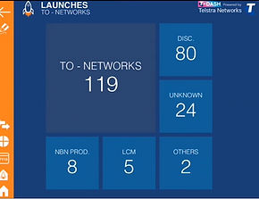
Contributed to the evolution and rollout of internal operational reporting platforms designed to improve project visibility, resource forecasting, workflow coordination, and stakeholder decision making across large-scale telecommunications environments.
Worked collaboratively with internal department leaders and stakeholders to transform complex enterprise data into scalable visual reporting systems supporting live operational oversight, project delivery tracking, and executive communication.
Role:
Began as a graphic artist and interface designer before evolving into a broader multidisciplinary role spanning UX workshops, workflow planning, stakeholder facilitation, prototype iteration, and product presentation.
Led collaborative design sessions with department stakeholders to map operational workflows, identify reporting requirements, and develop scalable UX systems tailored to live business environments.
Worked closely with developers, leadership teams, and operational stakeholders throughout prototyping, testing, rollout, and internal adoption phases.
Impact:
Supported the adoption and expansion of operational workflow and reporting systems across multiple internal departments, contributing to improved project visibility, resource planning, and stakeholder communication.
The platform was later adapted to support large-scale infrastructure initiatives including the Telstra Air public Wi-Fi rollout program and helped inform the evolution of an independent enterprise product platform.

Workflow Systems & Operational Coordination
Mapping enterprise workflows and operational reporting systems.


UX & Reporting Systems
Dashboard interfaces designed for rapid operational visibility.


Stakeholder Collaboration & Iteration
Collaborative planning, annotation, and reporting workflows.


Original Banner Design
Art Director
Paperville Panic
VR Experience & Campaign Delivery
Overview:
Led creative direction and production delivery for an award-recognised VR experience developed for multi-platform release and international exhibition, spanning interactive design, campaign assets, narrative systems, and immersive
audience experiences.
Role:
Directed multidisciplinary creative development across visual design, UX flow, narrative systems, level design, and production coordination throughout the project lifecycle.
Collaborated across a growing team of developers, artists, QA, marketing, and production stakeholders while managing workflows, creative approvals, communication pipelines, and delivery timelines across VR and mixed reality platforms.
Impact:
Expanded from an initial prototype into a full indie production following investor-backed scope growth, supporting international showcases including PAX Australia, PAX East (Boston), and Gamescom Germany.
The project received AGDA Award recognition and was featured in Kotaku Australia’s Top 10 Australian Games.
Original Release Trailer
Art Director + VO Performance
Key Contributions
Creative Direction • Narrative Design • UX Flow • Level Design • Production Coordination
• Stakeholder Communication • Voice Performance • Exhibition Delivery
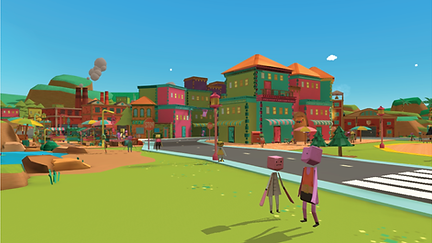

Narrative Systems
Explored tonal contrast between a playful paper-crafted world and escalating emergency scenarios, helping shape the game’s comedic identity and player immersion.


UX & Gameplay Flow
Designed onboarding and progression systems that gradually introduced player mechanics while balancing immersion, accessibility, and VR comfort considerations.


Level Design & Interaction
Developed mission structures, gameplay pacing, and interaction logic supporting player progression across multi-stage VR scenarios.


Creative Production
Supported the coordination and rollout of exhibition assets, promotional materials, and live playable builds for international showcase events.

PULSE
Experience Design • Game Design • Interactive Installation
• Gameplay balancing
• Physical interaction design
• Live installation testing
• Redesigned gameplay systems
• Simplified onboarding
• UX & UI Design

Pulse
Experience Design • Game Design • Interactive Installation
Redesigning a large-scale multiplayer interactive installation that connected four physical player stations through light, gameplay and live audience participation.
Role: Game Designer, UI/UX Designer
Studio: PLAY9 Studios / tkm9
Platform: Public Interactive Installation
Focus Areas: Experience Design, Gameplay Systems, UX/UI, Multiplayer Design, Live Entertainment
The Challenge
PLAY9's parent company, tkm9, was commissioned to create
an interactive light sculpture for Melbourne Central.
The installation connected four player stations through
a large-scale lighting structure suspended between Levels 2 and 3. Each station allowed players to compete against one another while the sculpture became a live visual extension
of the game.
The original gameplay, however, struggled in testing. Players found the mechanics difficult to understand, rounds took too long to begin, and many walked away before experiencing
what made the installation unique.
I was brought in to redesign the experience—redesigning the gameplay, improving onboarding, and reshaping the interaction so it was intuitive for first-time players while remaining engaging in a busy public environment.
The challenge wasn't just designing a game—it was designing an experience that could be understood within seconds by players walking past in a shopping centre.


Understanding Player Behaviour
Before redesigning the experience, I mapped the original gameplay to understand where players were struggling. While the mechanics worked on paper, observing real people in the space revealed a different story.
Players often didn't understand the objective, rounds took too long to begin, and much of the interaction happened before the game had earned their attention. In a busy public environment, every second mattered.
These observations became the foundation for every design decision that followed.


Designing for Public Spaces
Designing for a shopping centre meant designing for distraction. Players weren't arriving to play a game—they were simply walking past.
The experience needed to communicate itself within seconds, reward curiosity immediately, and encourage spectators to become participants. Every interaction was evaluated through the lens of clarity, pace and accessibility.


Meaningful Decisions
One of the biggest gameplay issues was that the fastest player simply won by repeatedly pressing the fire button.
Introducing a charge mechanic transformed the interaction from frantic button mashing into deliberate decision making. Players now had to balance timing, positioning and risk while still maintaining the fast pace expected in a public installation.
Every mechanic encouraged deliberate decision-making instead of frantic button mashing.
Connecting Digital & Physical
The interface wasn't the experience—it was only one part of it.
Every action on a player's console triggered changes throughout the physical sculpture, allowing spectators to follow the match from anywhere in the space.
The installation became a shared experience, where digital gameplay and physical architecture worked together to attract new players and create moments of spectacle.


Designing Better Feedback
Immediate feedback became critical to helping players understand what was happening without explanation.
Visual effects, score updates, damage states and end-of-game messaging gave players confidence in their actions while creating dramatic moments that could also be enjoyed by spectators.
Clear feedback reduced confusion and encouraged repeat play.
Outcome
The redesign transformed Pulse from a technically impressive installation into an engaging public experience built around intuitive gameplay and shared participation.
The project reinforced the importance of designing for context as much as functionality. Success wasn't measured by mechanical complexity—it was measured by how quickly people understood the experience, enjoyed it, and invited others to play.
Pulse remains one of my favourite examples of how thoughtful interaction design can transform complex technology into an experience people immediately understand and enjoy.


EMO AF transformed nostalgia into community.
More than a club night, it became a space for people to reconnect with the music, memories, and identity that shaped them.

EMO AF : STILL NOT A PHASE
IDENTITY SYSTEM & LIVE
MUSIC BRANDING
BUILT FOR
THE SCENE.
BY THE SCENE.


Designing for public spaces taught me that great interaction design isn't about adding features—it's about removing friction until the experience feels obvious.

01 IDENTITY SYSTEM



COLOUR PALETTE

HAILEY
ORANGE
VALENTINE
PINK
BLACK
PARADE
WEEPING
WHITE
PRIDE


DESIGNED TO BE LOUD.
MADE TO BE
REMEMBERED.


SKETCHES & EARLY DIRECTION

TYPEFACE
ASPHALT
02 TYPOGRAPHY
03 IN THE WILD


SPOTTED
IN THE WILD
04 MOTION & LIVE EXPERIENCE

FLAMED HEART MOTION


COLONIAL HOTEL


REVOLVER UPSTAIRS

WALL BLEED

Motion graphics and environmental visuals designed to transform venues into immersive extensions of the EMO AF identity.
05 ADAPTABILITY


BUILT TO ADAPT.
BUILT TO INCLUDE.
SAME MESSAGE,
DIFFERENT COLOURS
✔ Event Branding
✔ Merchandise
✔ Social Content
✔ Motion Graphics
✔ Environmental Design
ORIGINAL
VALENTINE PINK
PRIDE
06 MERCH & PRINT
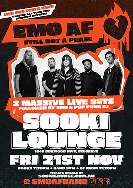


POSTERS. FLYERS. STICKERS. T-SHIRTS. TOTES.
ALL PART OF THE SAME WORLD
07 SOCIAL ROLLOUT


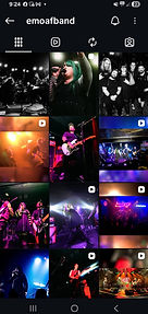
Social content extended the EMO AF identity beyond the venue, creating ongoing touchpoints before, during and after each event through promotional campaigns, community engagement and user-generated content.
08 IMPACT & OUTCOMES



-
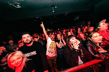
Recurring Melbourne event identity
-
Recognisable visual language
-
Adaptable across venues and audiences
-
Extended across print, merch, motion and environmental graphics
-
Supported community-focused event experiences

• CREATIVE DIRECTION
• BRAND IDENTITY
• MOTION DESIGN
• PRINT DESIGN
• ENVIRONMENTAL GRAPHICS
• MERCHANDISE DESIGN
• EVENT MARKETING
EMO AF began as an identity and evolved into a flexible visual system spanning events, merchandise, motion graphics and live experiences. The project demonstrates how a strong brand can create consistency across multiple touchpoints while remaining adaptable to different audiences, venues and cultural moments.


As A Rival
Independent Creative Direction,
Campaign Systems & Content Production
Overview:
Co-founded and creatively directed independent alternative rock project As A Rival across branding, campaign systems, visual direction, content production, merchandise, music videos, live promotion, and audience growth across multiple releases and touring cycles.
Role:
Oversaw multidisciplinary creative direction across
narrative development, artwork systems, campaign
planning, merchandise, music video concepts, EPK development, and social content while collaborating
with illustrators, videographers, photographers,
producers, and creative partners.
Impact:
Built cohesive release campaigns connecting artwork, video, live assets, merchandise, and social content into scalable audience-facing brand systems supporting streaming visibility, touring, audience engagement, and long-term growth.
Campaign Highlights
• 65k+ independent streams across multi-platform releases
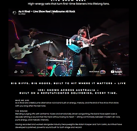
• 100+ live performances across Australia
• Ongoing short-form rollout across Instagram, TikTok, YouTube, and Spotify
• Developed cohesive release systems spanning artwork, music videos, merchandise, EPKs, and live promotion
• Produced social-first campaigns supporting audience growth and release visibility
Narrative & Visual Development
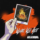
Developing thematic direction, symbolic systems, and campaign concepts.
Developed narrative systems and visual themes
exploring emotional conflict, identity, and interpersonal
tension, translating lyrical concepts into scalable campaign systems across artwork, merchandise, music videos,
and campaign content.
Collaborated with illustrators and creative partners to refine symbolic imagery and visual storytelling across multi-release campaign arcs.






.png)

Video Direction & Content Production
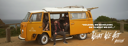
Translating campaign narratives into cinematic promotional content.
Collaborated with directors, videographers, and production teams to develop music videos aligned with broader campaign strategy.
Supported concept development, visual continuity, and rollout planning across music videos, social campaigns, trailers, and live content.


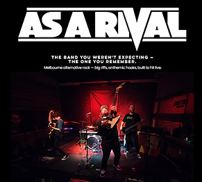

Live Promotion
& Audience Engagement
Building audience growth through
live experiences and digital campaign strategy.
Developed release campaigns, live promotional assets, EPK systems, and social content pipelines supporting streaming growth, touring,
and venue promotion.
Continued evolving the project through live content experimentation, social-first campaign systems, and long-term brand development across digital and physical platforms.


Torque Drift
UX/UI Systems Design for Mobile Competitive Racing
Redesigning gameplay communication, onboarding systems, and feature scalability for a live multiplayer drifting title.
Role: UI/UX Designer
Studio: Grease Monkey Games
Platform: Mobile
Focus Areas: Gameplay UI, Onboarding, Retention Systems, Tournament UX, Feature Expansion
Project Overview
Torque Drift is a competitive mobile drifting game focused on online battles, progression systems, and vehicle customisation.
Grease Monkey Games engaged me to help modernise and unify the game’s UI experience while improving usability, onboarding clarity, and long-term scalability for future gameplay systems and live-service features.
The Challenge
The existing UI had evolved organically over time, creating inconsistencies across gameplay, menus, onboarding, and progression systems.
New players experienced friction understanding core gameplay mechanics, while expanding feature sets — including tournaments, streaming integrations, and progression systems — required a more scalable visual and interaction framework.
The goal was to:
-
improve clarity without alienating existing players
-
retain the game’s aggressive visual identity
-
support future feature growth
-
strengthen gameplay readability and player feedback

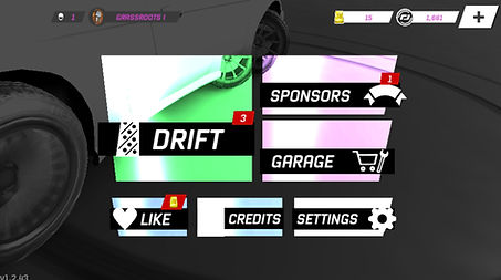
Original Landing Page

Proposed Updated Landing Page
UI System Refresh
The redesign focused on creating a more cohesive interface language across navigation, hierarchy, iconography, typography, and interaction feedback.
Rather than rebuilding the visual identity entirely, the update refined and systemised existing design cues to improve readability, consistency, and usability across the experience.
Gameplay Feedback
& Player Guidance
A major focus of the redesign explored how gameplay UI could better communicate drifting behaviour, correction timing, speed, and scoring feedback without overwhelming the player.
New interface concepts investigated:
-
drift angle readability
-
correction guidance
-
scoring visibility
-
speed integration
-
peripheral readability during gameplay
The aim was to support new players learning the mechanics while remaining lightweight enough for experienced players
to ignore intuitively.


Drift Meter Designs

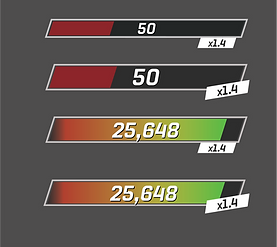
Drift Point UI Designs


Speedometer Concepts
Competitive Systems
& Retention Features
To support long-term player engagement, new tournament systems were explored to create repeatable competitive events and progression loops beyond standard drift battles.
The concepts introduced:
-
event scheduling
-
lobby systems
-
tournament brackets
-
live progression tracking
-
reward visibility
-
competitive identity systems
These additions aimed to increase retention while expanding the game into a broader live-service ecosystem.


Live Event
& Streaming Integration
Additional concepts explored integrating real-world drifting events directly into the game experience through livestream scheduling and event reminders.
The system allowed players to:
-
discover live drifting broadcasts
-
schedule reminders
-
connect gameplay with real motorsport culture
-
strengthen long-term community engagement


Player Identity
& Customisation

Vehicle customisation formed a major part of the Torque Drift player experience.
New vinyl pack concepts explored collectible cosmetic systems designed to:
-
increase player identity
-
support progression motivation
-
expand monetisation opportunities
-
reinforce drift culture aesthetics within the game ecosystem
Outcome & Reflection
The project became an exploration of how gameplay systems, onboarding, progression, and visual communication intersect within competitive multiplayer experiences.
Beyond interface polish, the redesign focused on creating scalable systems capable of supporting long-term feature growth, player retention, and evolving live-service functionality.
The work reinforced my interest in experience design that blends:
-
UX thinking
-
gameplay communication
-
systems design
-
visual identity
-
audience engagement
The project reinforced my passion for designing systems that balance gameplay clarity, competitive engagement, onboarding, and long-term audience retention across evolving digital ecosystems.
